Design and Application Guide for Custom-Size Labels
A practical guide to correct dimensions, bleed, safe area, wrap direction, curved surfaces and the sampling process in custom-size label projects.
Custom-size labels are a practical solution for products that do not fit standard dimensions, for unusual packaging shapes, or for brands that want to keep a specific design language. However, a custom size demands far more technical preparation than ready-made dies. If measurement, bleed, safe area, wrap direction and sampling are not planned from the start, unwanted results can appear during production or at the point of application.
This guide covers the essential points of custom-size label projects from design to application in a practical order. The aim is to help design and production teams share a common technical language, reducing rework, material waste and application errors.
How to Determine the Correct Dimensions
Setting the dimensions is the foundation of a custom label project. You should measure the actual surface where the label will be applied, the narrowest and widest points of the product, any curvature and any fold or seam allowance. A difference between the theoretical size on paper and the physical product surface is common. For this reason, measurement should always be taken on the real product and preferably repeated a few times.
When deciding dimensions, you should also consider the label after filling, closure and transport, not only its current state. Some packaging expands slightly or changes shape once it is filled, which can affect the tension and fit of the label.
Deciding Width and Height
When defining width and height, the legibility of the label, brand hierarchy, mandatory information fields and the content that must be presented to the consumer are evaluated together. A very narrow height can restrict font sizes and barcode height. A very wide label can increase cost and distort the shape of the packaging. A balanced approach is to place the mandatory fields first and the aesthetic elements afterwards.
Bleed and Safe Area
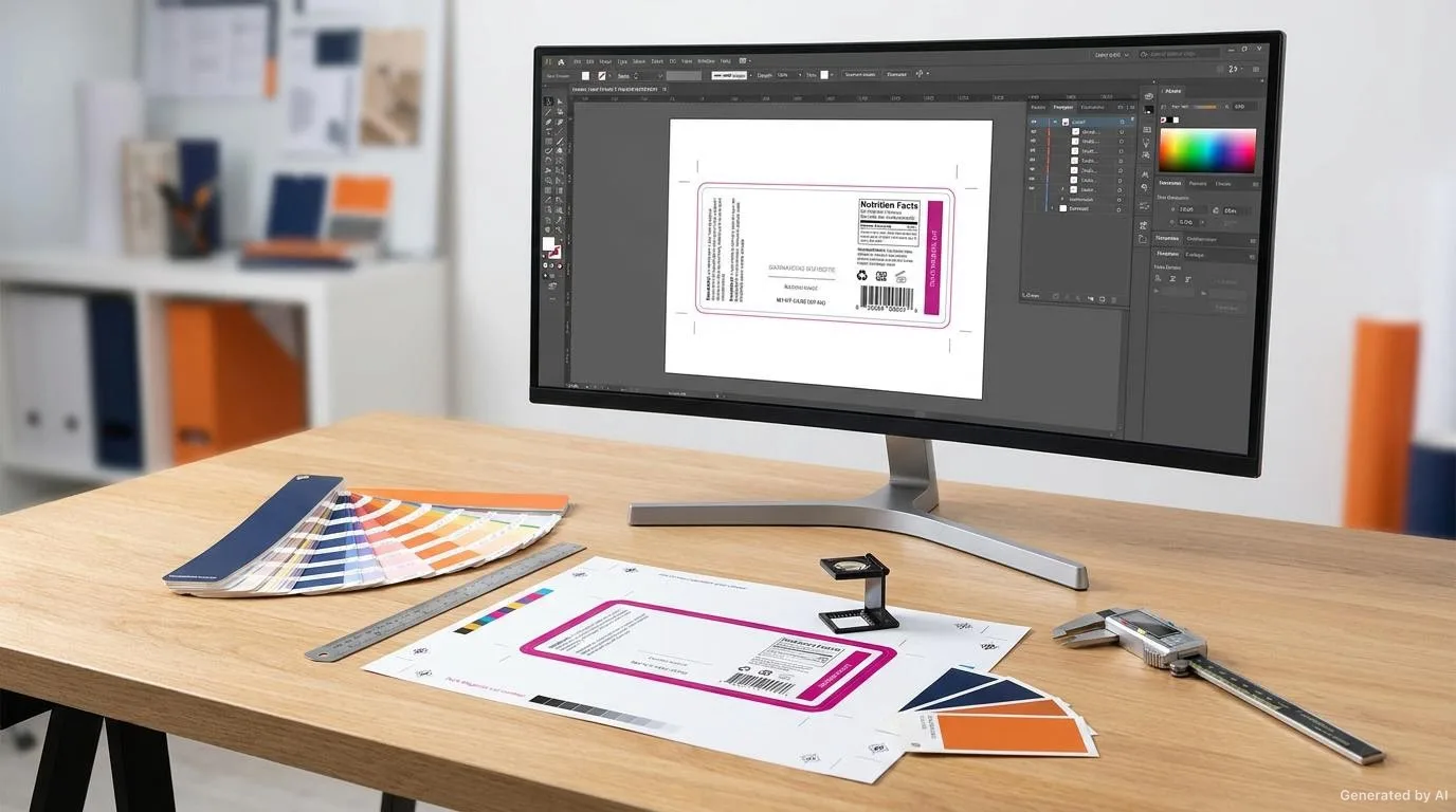
Bleed is the safety distance between the edges of the design and the actual cutting line. Critical elements such as text, logos and barcodes must stay inside the safe area. Otherwise, there is a risk of trimming due to cutting tolerance. As a general approach, leaving a certain safety margin inward from the edges helps to absorb production tolerances. If a full-bleed background is used, extra care is needed so that a white edge does not appear where the background approaches the cutting line.
Designing According to the Wrap Direction
In roll labels the direction of the artwork is directly related to how the application device works. The direction in which the label leaves the roll determines on which side the leading edge will be and on which axis the barcode will be read. Artwork prepared without considering the wrap direction can be positioned incorrectly or read upside down on automatic applicators. The application method should therefore be clarified before the artwork file is prepared.
Horizontal and Vertical Wrap
In a horizontal wrap the design elements flow across the width of the label, while in a vertical wrap they flow along its height. The barcode should be placed in the orientation expected by logistics or retail readers. During sampling the direction of the application device should always be verified and the artwork rotated accordingly.
Print Direction and Typography
The print direction can influence the quality of colour transitions and fine lines. Very small type and thin lines can lose sharpness depending on the print direction and resolution. Minimum sizes should therefore be respected for critical typography and the print direction should be tested on the sample.
Minimum Legible Sizes
The smaller the custom size, the more important the legibility limits become. There are safe minimum sizes for text read by the human eye, for barcodes and for warning text. Font size, the character width of the font family and print resolution all influence one another. Achieving this balance on a small label requires more attention than on large labels.
- Use a reasonable minimum font size for normal reading text.
- Plan the height and module width of barcodes according to reader expectations.
- If you use negative, that is white text, adjust the background colour and line thickness accordingly.
- Avoid very thin lines and hairline rules for critical information.
Fitting the Packaging Surface and Curved Surfaces
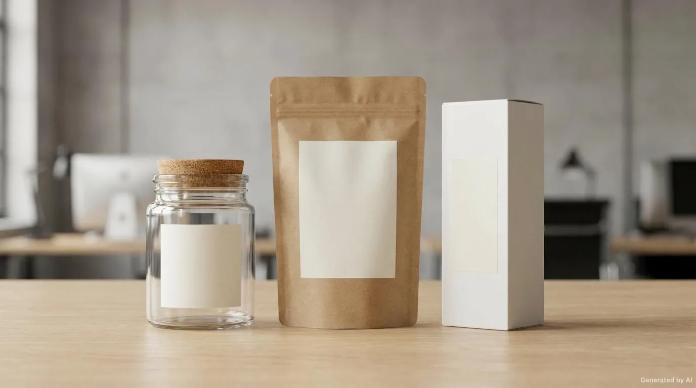
A label is often applied not to a flat surface but to a curved, domed or recessed package. On curved surfaces the material thickness, adhesive flexibility and label size must be considered together so that the label does not curl, blister or lift at the corners. Very wide labels on small-diameter bottles may tend to release after application.
Surfaces Exposed to Impact and Friction
Where the product is exposed to friction during transport, display or use, surface protection and adhesive strength come to the fore. On such products it is useful to position the label edges away from the areas that are touched most.
Die and Cutting Methods
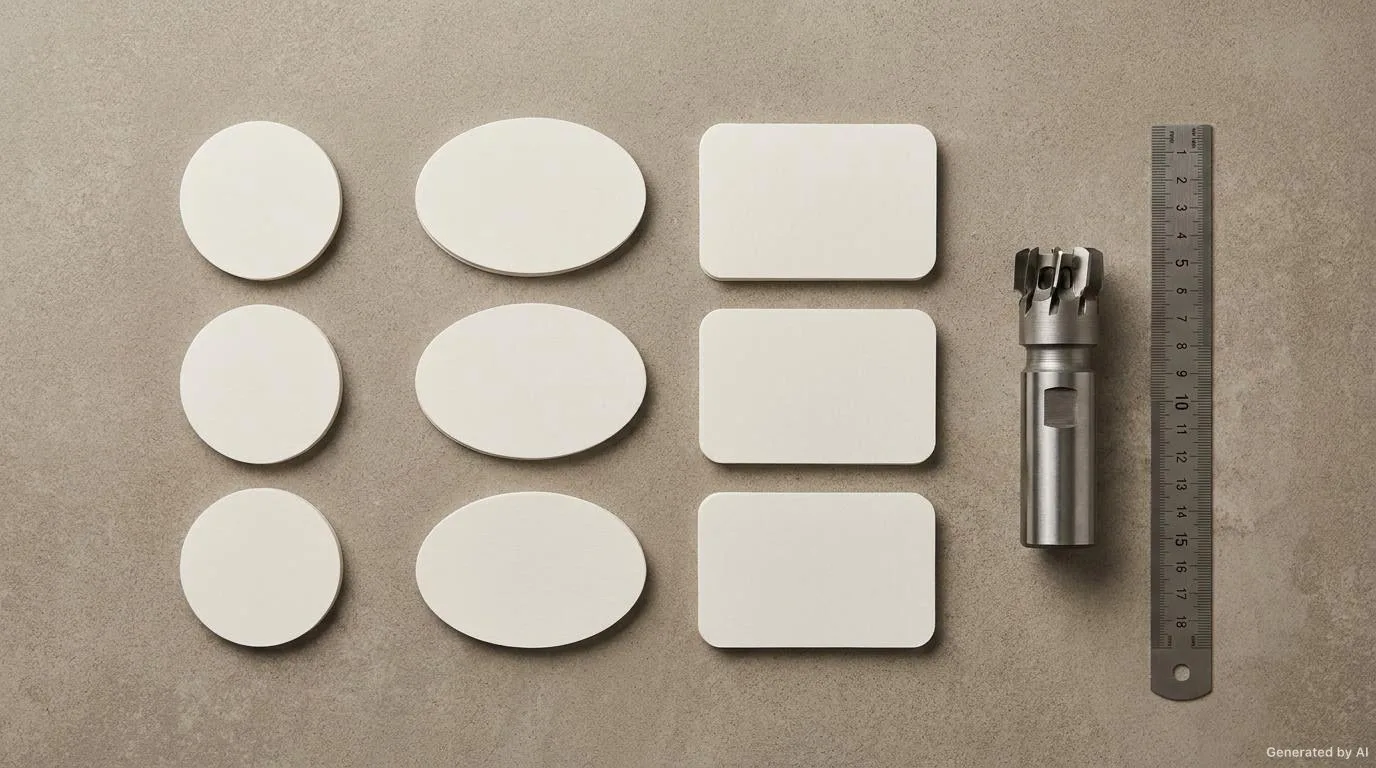
The cutting method used for custom-size labels is chosen according to quantity, shape complexity and the desired edge quality. Different die approaches may suit simple rectangular shapes and different ones suit specially shaped, highly detailed work. The balance between die cost and quantity directly affects the total cost.
| Method | Suitable Use | Edge Character | Points to Watch |
|---|---|---|---|
| Straight rectangular cut | Standard-shaped products and high quantities | Sharp, regular edge | Rounded corner needs should be assessed separately |
| Rounded corner | Products handled by hand with a risk of corner lift | Soft, durable corner | The radius should be clearly defined in the artwork |
| Custom shape die | Unusual contours matching the brand shape | Custom contour | Fine details may be lost in the cut |
| Multi-layer cut | Work combining more than one material | Layered appearance | Layer alignment and adhesion should be tested |
Why the Sampling Process Matters
A sample is the most critical intermediate step in custom-size label projects. Even if the design looks correct on screen, different results can appear when it is combined with the real material, the real cut and the real application surface. During sampling, dimensions, cut, colour, legibility and adhesion are evaluated together. Small corrections made at this stage can prevent large losses in series production.
Sampling Steps
- Check dimensions, layout and legibility with a digital proof.
- Run a print and colour trial on the real material.
- Apply the sample to the real product surface and observe the fit.
- Assess edge and adhesion behaviour after short-term use and contact.
Common Dimension and Layout Mistakes
Some mistakes recur again and again in custom label projects. Knowing them in advance makes it easier to correct before production.
- Defining the size only in digital files without measuring the real product.
- Neglecting the safe area and bleed by placing text too close to the edge.
- Sending the file to production without verifying the wrap direction with the applicator.
- Leaving the barcode below the minimum legible height.
- Applying the same design to products of different sizes without adjusting proportions.
- Skipping the sampling step and going straight to series production.
You can find more detail about common design mistakes in this article.
Pre-Delivery Checklist
Reviewing the following items together before sending to print reduces surprises at the application point.
- Have the dimensions been verified on the real product?
- Are bleed and safe area defined on all edges?
- Are the wrap direction and print direction compatible with the applicator?
- Are text and barcode above the minimum legible sizes?
- Has the material and adhesive choice been reviewed for curved surfaces?
- Has sample approval been obtained?
- Have colour values and backgrounds been checked for the cutting edge?
Conclusion
Success in custom-size label projects depends largely on the clarity of the initial technical decisions. Correct dimensions, a defined bleed, artwork suited to the application direction and a verified sample make the process predictable on both the production and application side. For those who also want to run the quotation stage in an organised way, our quotation preparation checklist can be a useful guide.
If you have a custom-size need for your own product, we can assess your design decisions together before production begins. To discuss suitable material, cutting and wrap options, reach us through our our label solutions page.
Frequently Asked Questions
Why is bleed needed on a custom-size label?
Bleed prevents critical elements such as text and barcodes from being trimmed by cutting tolerances and provides a safe edge distance.
How does the wrap direction affect design?
The wrap direction determines how the label leaves the roll and on which axis the barcode is read. For correct positioning on automatic applicators the artwork should follow that direction.
What should be considered on curved surfaces?
On curved surfaces the material thickness, adhesive flexibility and label width should be evaluated together. Very wide labels may lift at the corners on small-diameter surfaces.
Why should the sampling step never be skipped?
A sample is the most reliable way to verify dimensions, colour, legibility and adhesion together with the real material and the real application surface.
Want to Determine the Right Label for Your Product?
Share your usage area and needs with us; let's evaluate suitable options together.